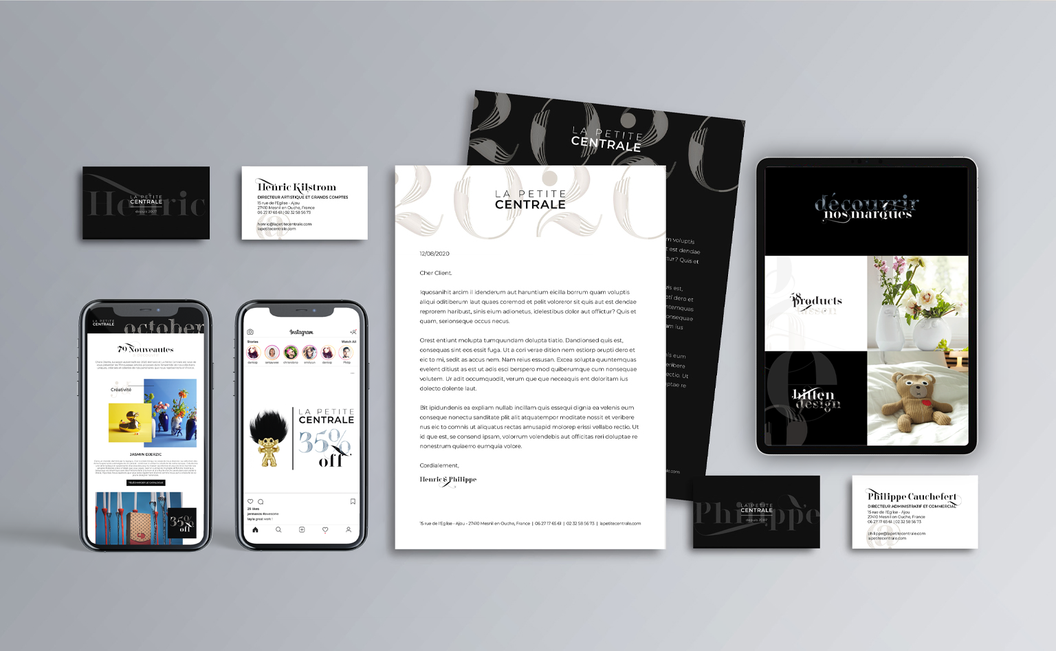
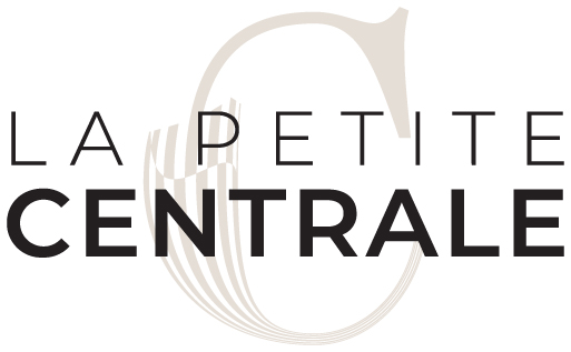
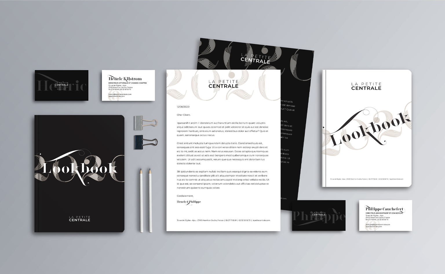
We helped develop new positioning for La Petite Centrale, a home-goods retailer. Several brand applications were created, from a new logo to event applications.
Our main focus: to visualise the dynamic brand personality. We created a refreshed corporate identity based on three new visual concepts: discovery, playfulness, and contrast. These are the core concepts La Petite Centrale’s new visual identity was built on.
Location Normandy, France
Industry Home-goods retail
BRAND VISUAL
IDENTITY
STRATEGY & DESIGN
Location Normandy, France
Industry Home-goods retail
We created a refreshed corporate identity for La Petite Centrale, a commercial agency focusing on unique home goods. This included the development of several brand applications, from a new logo to event applications. The brand’s dynamic personality is brought to life through three key visual concepts: discovery, playfulness and contrast.
BRAND IDEA
La Petite Centrale believes that the types of goods that people display in their homes should always have a story that’s worth telling. In homage to this narrative philosophy, our visual style embraces the dynamic use of typography, rich colour contrasts and floating elements, all of which draw customers in and invite them to discover the hidden stories the products have to tell.
BRAND IDEA
La Petite Centrale believes that the types of goods that people display in their homes should always have a story that’s worth telling. In homage to this narrative philosophy, our visual style embraces the dynamic use of typography, rich color contrasts and floating elements, all of which draw customers in and invite them to discover the hidden stories the products have to tell.
VISUAL DESCRIPTORS
Core visual concepts
The new visual identity is based on three core visual concepts: discovery, playfulness, and contrast.
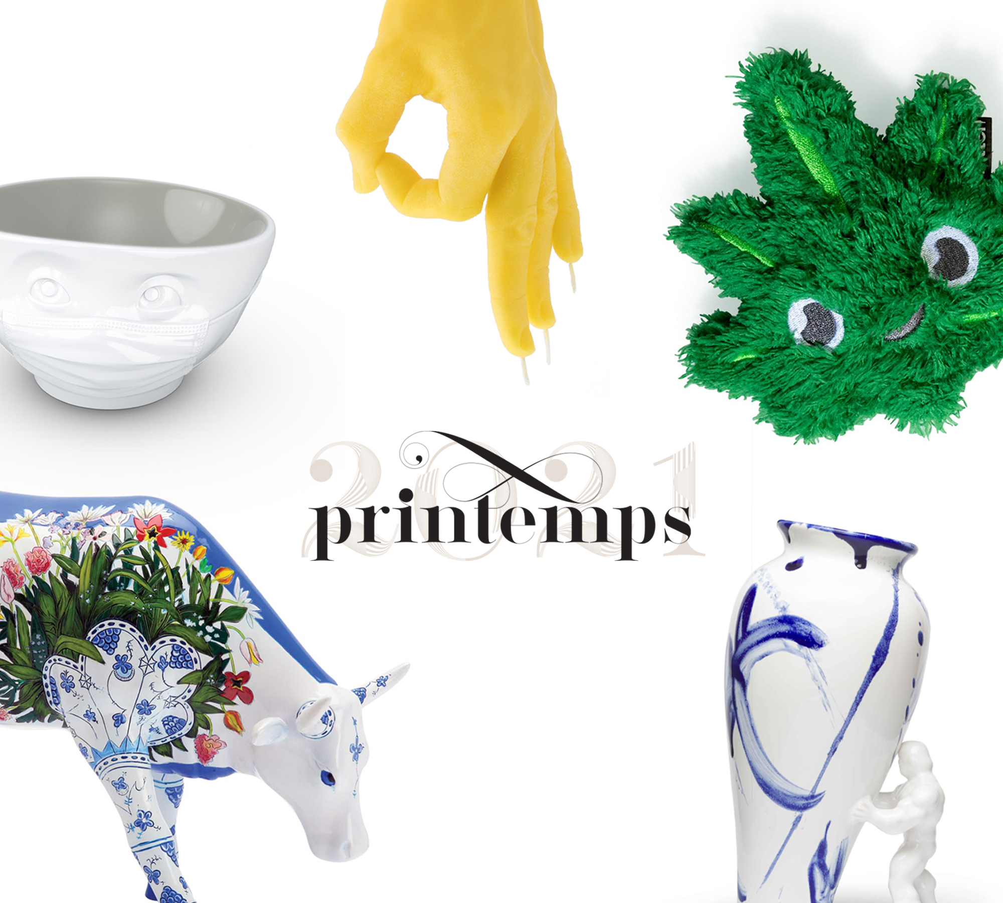
DISCOVERY
The combination of stacked design components and cropped elements adds depth to the design, leaving something hidden to discover.
PLAYFULNESS
The inclusion of 3D, floating, and diagonal elements brings to life the playful quality of the brand.
CONTRAST
Juxtaposed notions of minimalism & excess contrasted against edginess & refinement bring a modern yet timeless quality to the visual style.
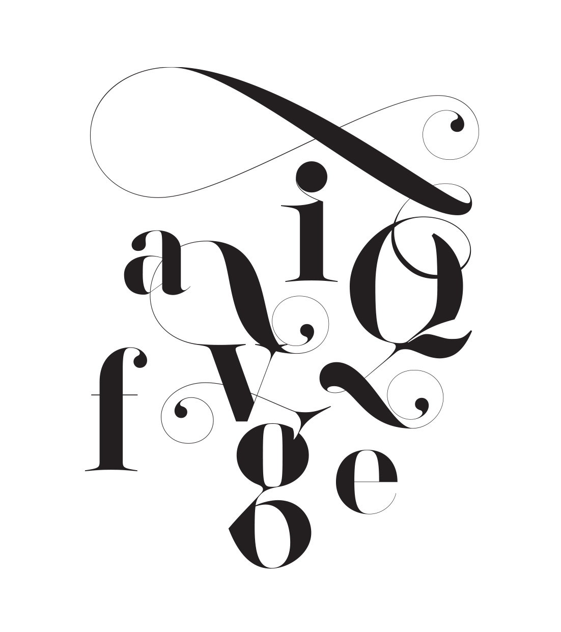
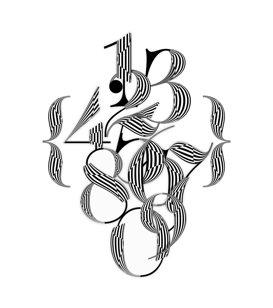
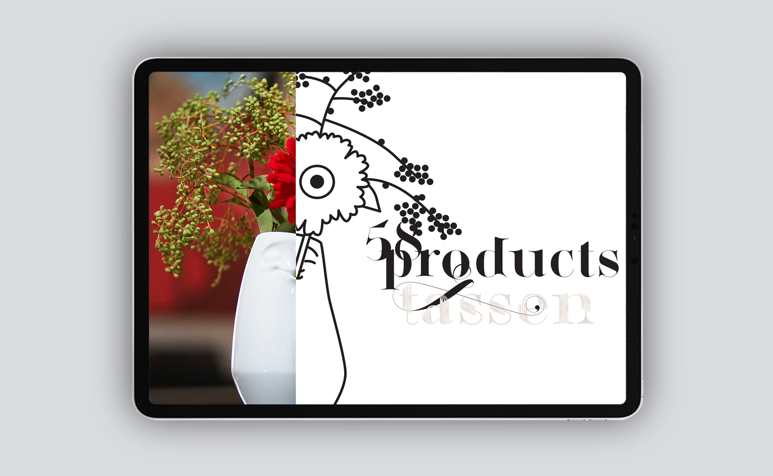
TYPOGRAPHY
The brand’s typographic footprint juxtaposes an adventurous fashion font with a sleek, modern body font, striking the perfect balance between whimsy and dependability. We created a custom 3D version of the brand’s flagship font, providing flexibility for seasonal collections and marketing campaigns. The brand’s typographic footprint juxtaposes an adventurous fashion font with a sleek, modern body font, striking the perfect balance between whimsy and dependability. We created a custom 3D version of the brand’s flagship font, providing flexibility for seasonal collections and marketing campaigns.
Special Font
Lingerie Wild Pro Chimera X
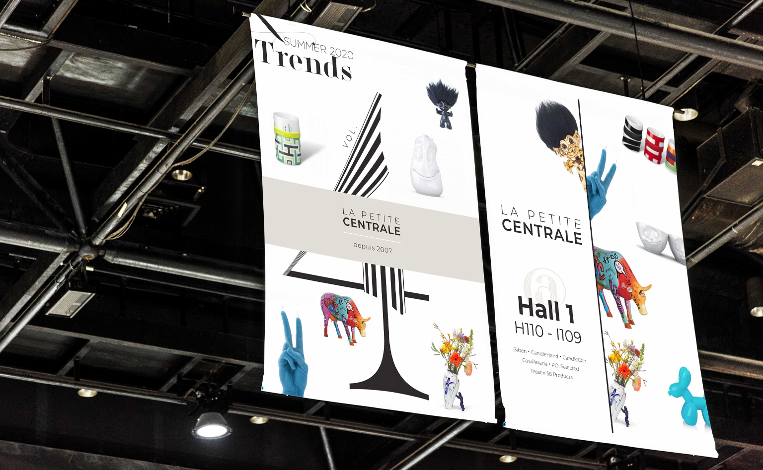
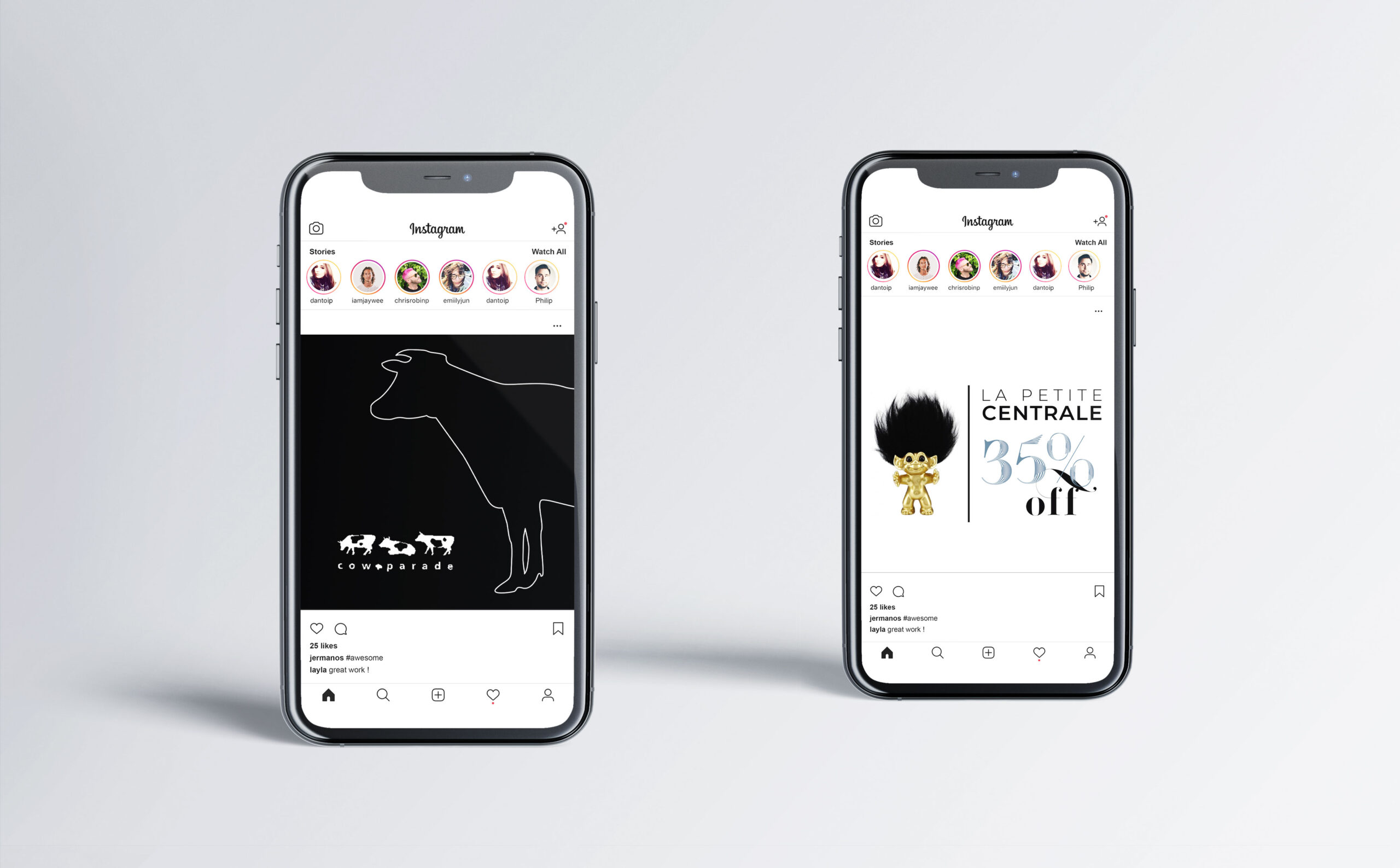
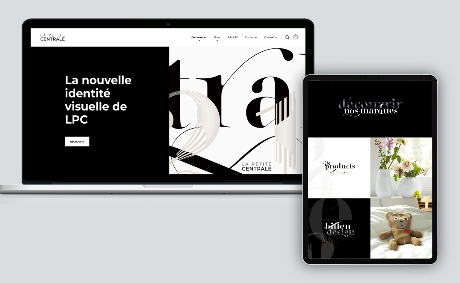
APPLICATIONS
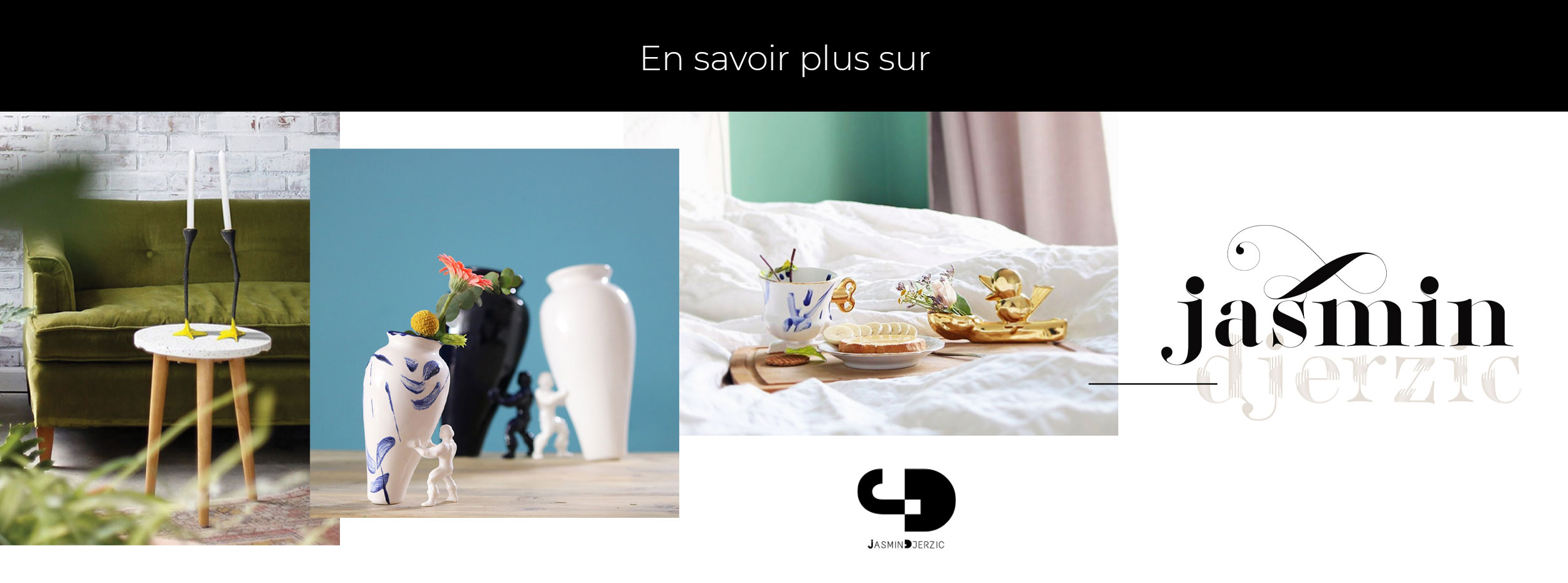
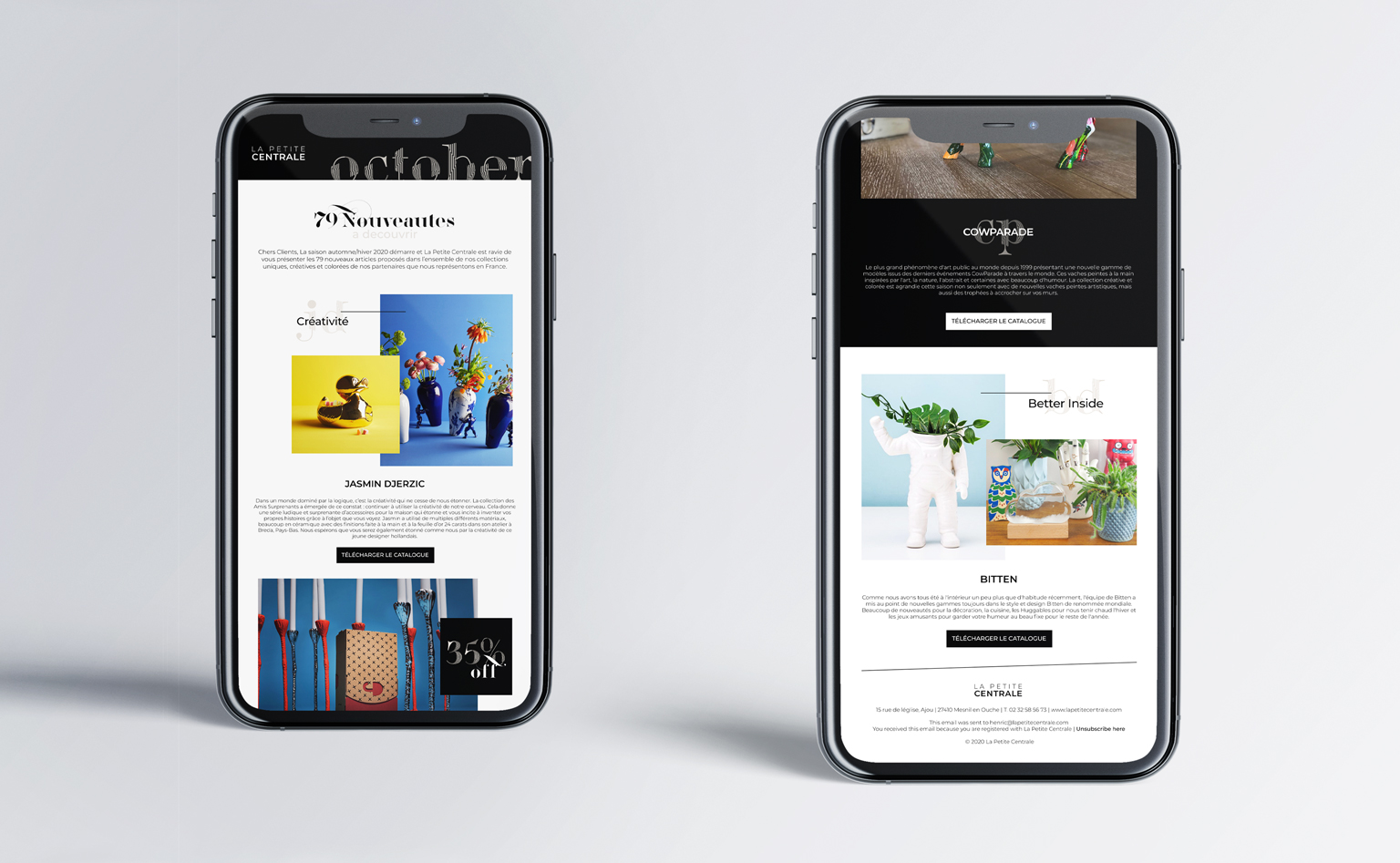
We completed the brand guide with sample layouts in various formats, to demonstrate the proper use of the brand’s new graphic elements and composition rules.
CLIENT PROFILE
La Petite Centrale is a multi-brand home-goods retailer. They connect innovative international brands with French retailers. As a commercial agency with over 20 years of experience on the French gift, design and decoration market, they specialise in launching new brands on the French market and in helping them build a solid constituency of clients. La Petite Centrale believes the best designs tell a story worth hearing therefore actively seek partnerships with designers and brands who share this philosophy. This is what they continue to do for over 500 shops and concept stores across France.
It looks like you are using an outdated browser to access our website which may cause certain pages to display in unpredictable ways. This is because old browsers do not support the type of code we use to create modern websites that function responsively on mobile devices.
We greatly appreciate your visit here and hope you will consider updating or switching to another browser such as Chrome or MS Edge before proceeding. We want you to have the best experience possible.