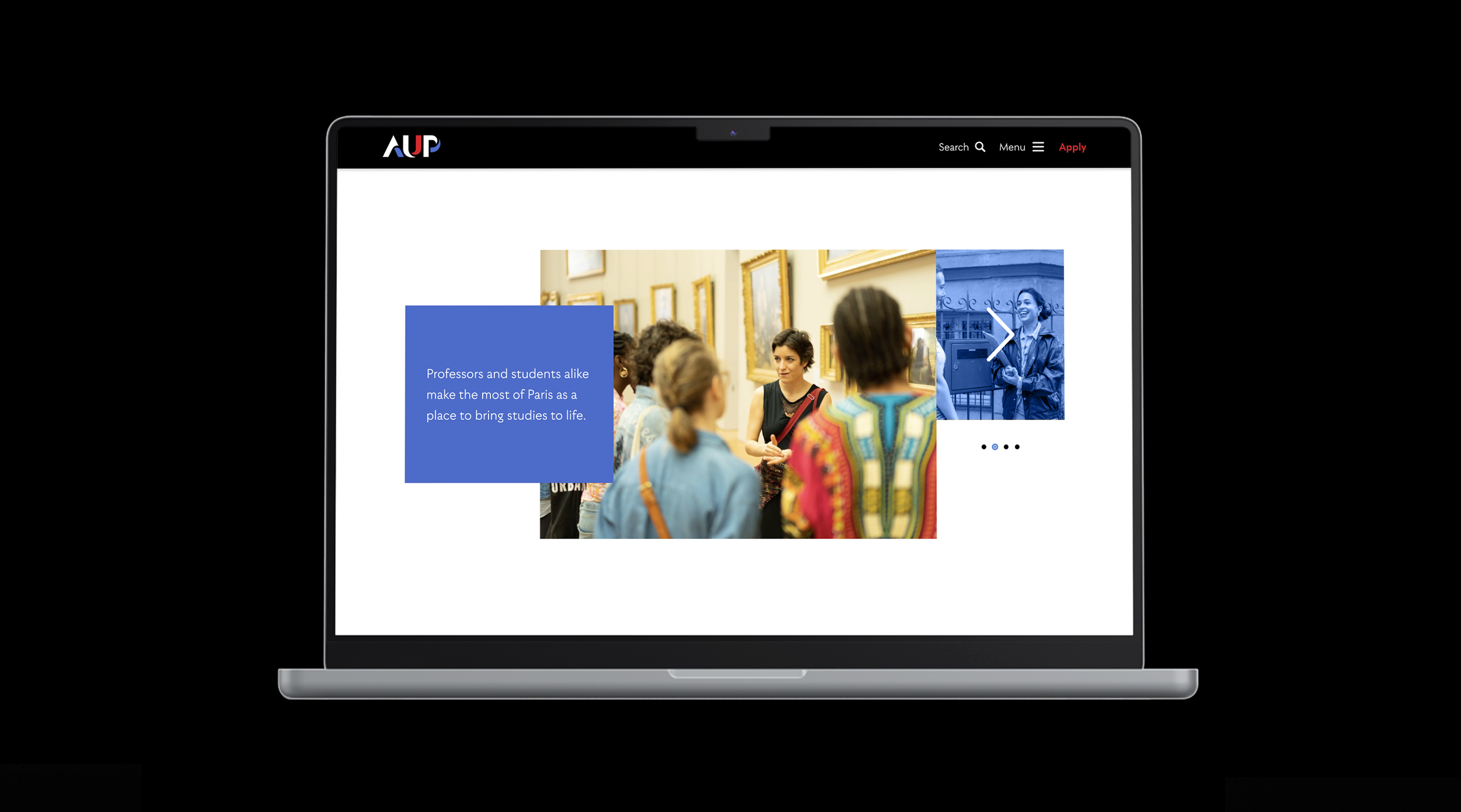
Project Summary
STRATEGY & DESIGN
We developed a complete content strategy and provided the University’s graduate programs with their own unique web space and online identity. Helping prospective students identify the unique value that AUP offers on an increasingly competitive graduate studies market.
This included the creation of 10 templates with 6 header options, 20 custom widgets, and special features, as well as a differentiated mini-site for program pages with specific features.
Location
Paris, France
Industry
Education
STRATEGY & DESIGN
Location
Paris, France
Industry
Education
Over the course of two years we conducted an intensive research process to support the creation of a clear identity and USP for the American University of Paris’ various graduate programs. We then translated this work into a bespoke website design and custom content strategy.
The design for the graduate studies website is informed by insights gleaned from over 300 hours of research, including market analysis and interviews with staff and students. It was further influenced by the university’s new brand identity, relationship to Paris, and academic strengths. The visual identity centres around the needs and interests of prospective students and captures the transformative experience AUP offers.
DESIGN PRINCIPLES
AUP gives graduate students the opportunity to grow and develop often hidden aspects of their own international ambitions that are synonymous with the values and academic rigour iconic to Paris. Our design expresses these subliminal qualities through the dynamic layering of elements, asymmetry and a layout that thinks outside the box.
LAYERING
Layered graphic elements create visual depth that mirrors the depth of intellectual exchange prevalent on the campus.
ASYMMETRY
Asymmetrical compositions and uneven margins capture the energy of the city, creating dynamic movement.
DUOTONE EFFECT
A duotone effect on images embodies the multiplicity of perspective that students gain through intensive dialectical study, adding visual impact while drawing attention to key interface elements.
MULTI-TONE COLOR PALETTE
A multi-shade color palette creates visual paradox, imbuing the brand with a modern, airy feel. It introduces a dynamic contrast without overwhelming the viewer.
MOTIFS
The brand’s iconic motifs create playful visual cohesion, signposting important elements throughout the website.
A full suite of templates and widgets were designed with flexibility and responsiveness at their core, enabling an endless combination of design elements to support the sustainable growth of the site for years into the future.
Each program has its own mini-site that includes dedicated navigation and a user-friendly display of key information.
Dear Reader,
It looks like you are using an outdated browser to access our website which may cause certain pages to display in unpredictable ways. This is because old browsers do not support the type of code we use to create modern websites that function responsively on mobile devices.
We greatly appreciate your visit here and hope you will consider updating or switching to another browser such as Chrome or MS Edge before proceeding. We want you to have the best experience possible.
Kind regards,
The Leland Team